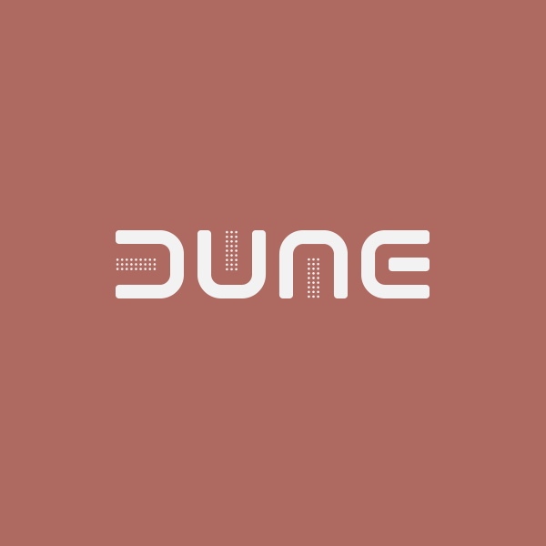
Logo and motion design for the film
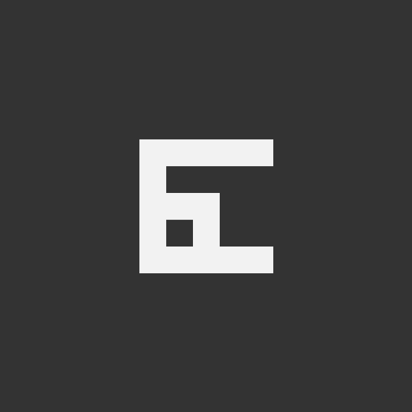
The unique letter combination found in the word DUNE is a near-perfect match for rotational symmetry, but the middle bar of the E adds a challenging complication.
In this solution that anomalous bar is embraced to unify each rotation of the glyph, and features prominently as a kinetic element in the motion treatments.


© 2026 Britt Funderburk Design